

Have you ever wondered why certain brands instantly grab your attention while others fade into the background? It’s not just about flashy designs or big names—it’s about colour. More specifically, it’s about colour psychology, a powerful tool that experienced graphic designers use to connect brands with emotions, influence consumer decisions, and elevate visual storytelling.
At Folks Digital, we’ve seen firsthand how the right colour choices can transform a basic graphic into a message that speaks directly to its audience. In today’s crowded marketplace, understanding the psychology of colour isn’t just a “nice-to-have”—it’s a necessity for creating visuals that work.
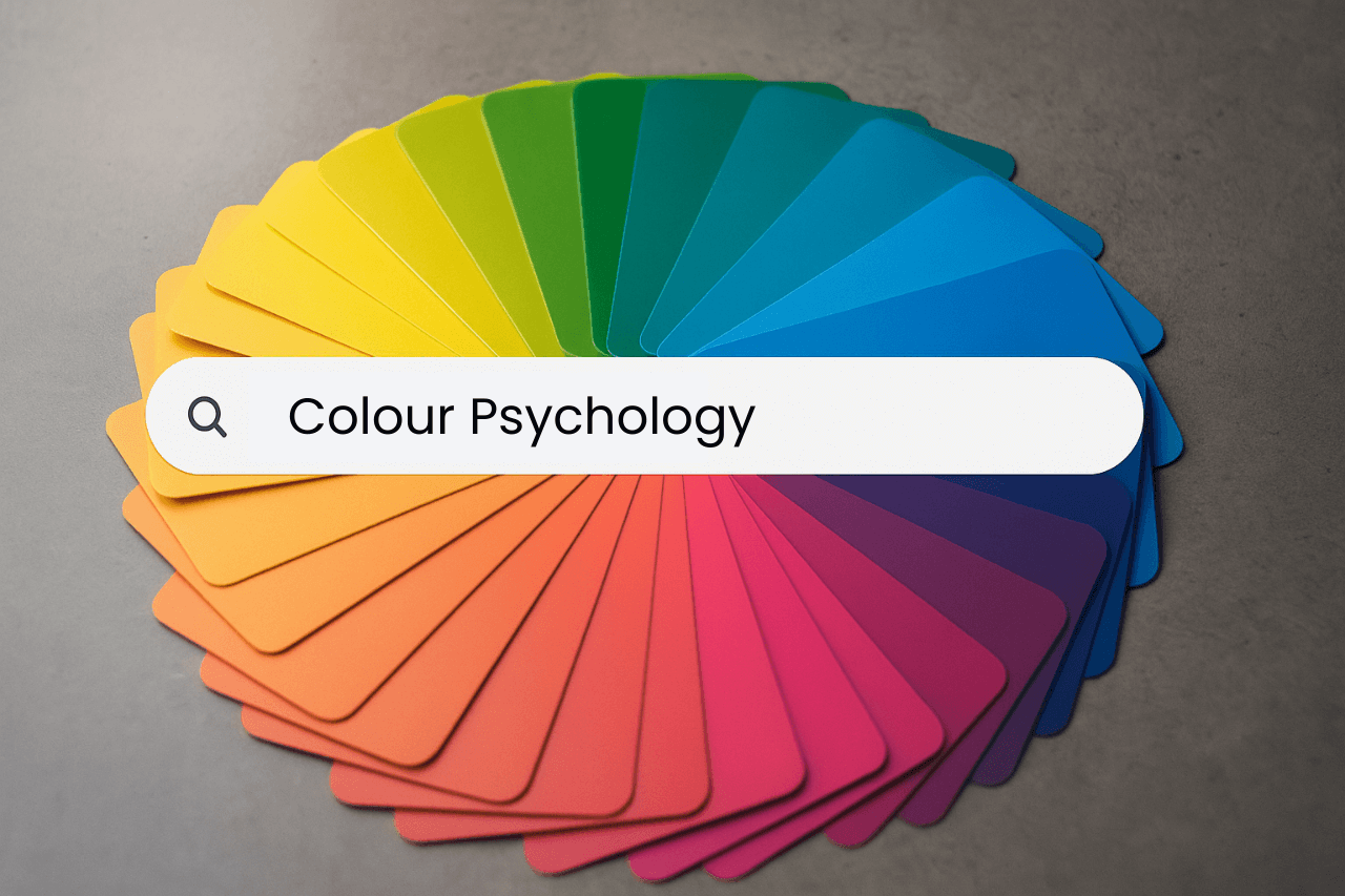
Colour psychology is the study of how colours influence human emotions and behaviours. In marketing and branding, it plays a crucial role in shaping how customers perceive and respond to visual content.
Let’s face it—first impressions happen in milliseconds. Before a user reads a headline or digests your message, their brain is already reacting to the colours in your design. Whether it’s a bold red that evokes excitement or a calming blue that builds trust, colour silently sets the tone for your brand’s message.
In fact, studies suggest that up to 90% of snap judgments about products can be based on colour alone, depending on the product and the consumer. For businesses trying to stand out in a competitive market like Canada, this knowledge is gold.
Every colour triggers different emotional and psychological responses. When used intentionally, these reactions can shape consumer perceptions and buying decisions.
Here’s a quick breakdown of common colour associations in marketing:
When you understand what each colour communicates, you can use them strategically in your branding, packaging, websites, and social media content. The goal? To evoke the right emotion at the right time and guide customers toward action.
But knowing this is one thing—applying it effectively is another. That’s where the value of working with an experienced graphic designer becomes clear.
Colour isn’t just about picking something that “looks nice.” It’s about balancing hues, tones, and contrasts in a way that supports your brand message and business goals. A skilled graphic designer understands the psychology behind colour selection and how to weave it seamlessly into every visual element.
Think of it like interior decorating—sure, anyone can buy furniture, but it takes a professional to create a cohesive, functional space that feels just right. The same goes for your brand visuals. From logos to social posts to full marketing campaigns, every design decision should be intentional.
At Folks Digital, our custom graphic design services don’t just focus on making things look good—they focus on making them work. That means considering:
This blend of strategy and creativity is what transforms a simple graphic into a powerful brand statement.
Off-the-shelf templates can only take you so far. If you’re serious about building a memorable brand, custom graphic design is the way to go.
Why? Because custom means tailored. It means every element—from your brand colours to your typography—is designed specifically with your audience in mind. Instead of blending into the noise with generic visuals, your business stands out with originality, purpose, and personality.
Professional graphic design services in Canada—especially from our team that understands the nuances of local markets—can help you:
And when colour psychology is baked into every decision? You don’t just get beautiful designs—you get effective ones.
Great design doesn’t just happen. It’s the result of deep understanding, creative intuition, and strategic execution. Whether you’re launching a new brand or refreshing an existing one, partnering with the right design team can make all the difference.
We’re passionate about crafting meaningful visual stories that get results. Our team of expert graphic designers understands how to harness the power of colour psychology to create marketing graphics that speak, connect, and convert.
Let’s collaborate to bring your vision to life through custom graphic design tailored for your business goals.
Ready to make your brand unforgettable? Contact Folks Digital today at (250) 580-3532 or click here to explore our professional graphic design services in Canada.
Your brand deserves more than generic. It deserves to be felt. Let Folks Digital help you turn colours into conversations—and clicks into customers.
It can. If the colours you use send mixed messages or clash with your brand identity, they may turn people off or create confusion. For example, using bright, playful colours for a financial firm could make your brand seem less trustworthy. Colour choices should always align with the tone and intent of your message.
Yes, colours can influence how people feel, think, and even act. For example, blue often builds trust, while red creates urgency. When used strategically in marketing graphics, these emotional triggers can guide customer decisions—whether it’s clicking a button, making a purchase, or remembering a brand.
Absolutely. Even if you’re not a graphic designer, understanding the basics of colour psychology can help you make smarter decisions. Whether you’re choosing a social media post background or a call-to-action button colour, applying simple principles can make a noticeable difference in engagement.
Yes. Overloading your design with multiple colours can confuse your audience and weaken your message. It’s better to stick to a focused colour palette—usually 2 to 4 main colours—that aligns with your brand and message. Simplicity often leads to a stronger impact.
There’s no one-size-fits-all answer—it depends on your brand, audience, and goals. That said, certain colours tend to evoke specific reactions. For instance, green is often associated with health or sustainability, while black can signify luxury. Knowing your audience and brand message will help you pick the right colours.
